


Understanding Color Psychology in User Interface Design
Color psychology plays a crucial role in user interface (UI) design, influencing how users perceive a product and how they interact with it. Each color elicits specific emotions and associations, making it essential for designers to consider the psychological impact of their color choices. For instance, blue is often associated with trust and dependability, while red can invoke feelings of urgency or excitement. By understanding these associations, UI designers can craft experiences that resonate with users and enhance their overall engagement.
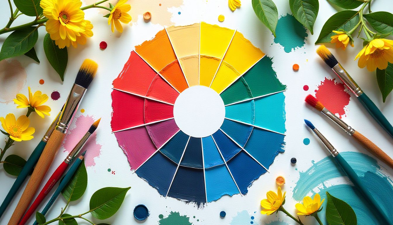
Key Colors and Their Psychological Effects
Different colors can evoke a wide range of emotions. Here’s a breakdown of some key colors commonly used in UI design and their psychological effects:
- Blue: Often linked to calmness and trust, blue is frequently utilized in corporate websites and online banking apps to promote a sense of security.
- Green: Symbolizing nature and tranquility, green is an ideal choice for environmental or health-related interfaces, as it promotes balance and harmony.
- Yellow: Representing optimism and energy, yellow can be stimulating but should be used sparingly, as it may overwhelm users if overused.
Integrating these colors thoughtfully into your designs can help guide user emotions toward favorable interactions with your product. Remember that cultural associations with colors can also vary, so it’s vital to consider your target audience’s background.
Applying Color Psychology to Improve User Experience
To leverage color psychology effectively in UI design, consider the following tips:
- Establish a Color Palette: Creating a coherent color palette that aligns with your brand identity is essential. Tools like Adobe Color can help generate color schemes that maintain visual harmony.
- Test with Users: Conduct usability tests to understand how different colors influence user behavior and preferences. A/B testing can be particularly helpful in analyzing the impact of color changes.
- Functionality and Emotion: Ensure that the functional elements of your interface, such as buttons and links, are intuitively colored to signify actions. For instance, using green for “confirm” actions and red for “cancel” can drastically improve navigational clarity.
When adequately implemented, these strategies can enhance the user experience, create a stronger emotional connection, and potentially increase conversion rates. Are you ready to apply these principles in your next UI design project?
Explore our other content in the Technology category.

The Impact of Colors on User Emotions and Behavior
Understanding the impact of colors on user emotions and behavior is pivotal for designers and marketers alike. Colors have intrinsic meanings and can invoke a range of psychological responses. For instance, warm colors like red and orange are often associated with passion or excitement, while cooler tones like blue and green tend to evoke calmness and serenity. By strategically using colors in web design, branding, or marketing materials, companies can create a nurturing environment that aligns with their brand identity and objectives.
Understanding Color Psychology
Color psychology refers to the study of how colors influence human perception and behavior. Various colors resonate differently with people, often linked to personal experiences and cultural backgrounds. Here’s how major colors impact emotions:
- Red: Typically associated with energy and urgency, red can provoke attention, making it a popular choice for call-to-action buttons.
- Blue: Often conveys trust and stability, which is why many financial institutions use it in their branding.
- Green: Symbolizing nature and health, this color can promote relaxation and is commonly seen in products related to wellness.
Colors and User Behavior
The effect of colors extends beyond emotions; they can significantly influence user behavior. For instance, studies have shown that users are more likely to click on links or buttons that are in contrasting colors to the surrounding content. This technique helps such elements stand out. Here are practical insights for applying this knowledge:
- Contrast Is Key: Ensure that the most important elements, like calls-to-action, employ colors that stand out against the background for optimal visibility.
- Consistent Branding: Maintain a consistent color scheme throughout your website or materials. This consistency fosters brand recognition and trust.
- A/B Testing: Regularly perform A/B tests to evaluate how different color choices affect user engagement and conversions, allowing you to adjust based on pragmatic data.
Practical Tips for Color Implementation
Selecting the right colors requires an understanding of your target audience and the emotions you aim to trigger. Think about the cultural implications and personal sentiments associated with various colors in your specific market. Would your audience respond better to a playful pink or a serene shade of blue? Consider running surveys or engaging in focus groups to gain insights into color preferences among your users. This practice can enhance your design strategy significantly and ensure your colors resonate well.
Creating a Color Palette
Establishing a color palette is crucial in maintaining harmony and identity across your design elements. Start with a primary color that embodies your brand, then choose complementary colors that represent secondary emotions or themes you want to convey. Here are some tips for creating an effective color palette:
- Use Online Tools: Websites like Adobe Color or Coolors can help you generate color palettes that work well together, making the design process streamlined.
- Limit Your Palette: A simple color scheme of one or two primary colors and a few accents can often be more powerful than a cluttered multitude of colors.
- Test in Context: Always view your colors in the context of your design. Monitor how they appear on different devices and lighting conditions to ensure consistency.
Future Trends in Color Usage
As we look to the future, it’s essential to keep an eye on evolving trends in color use. As digital platforms become more prominent, colors will play an even more influential role in user experience design. Experimenting with muted tones may emerge as a trend, as minimalistic designs become increasingly popular. Understanding current and future trends will help your designs remain relevant and emotionally impactful.
Check out our articles for developments in the world of technology.

Selecting the Right Color Palette for Effective User Experience
When designing a website or application, the importance of color cannot be overstated. Color palettes are crucial in shaping user perceptions and interactions. They influence emotions, convey branding, and drive user engagement. A well-thought-out color scheme can significantly enhance the user experience (UX) by ensuring that the interface is intuitive and visually appealing. Understanding the psychology of colors and the basics of color theory is essential for designers aiming to create a positive experience for their users.
The Psychology of Colors in User Experience Design
Colors evoke emotions and associations that can vary widely across different cultures and contexts. For instance, blue often communicates trust and professionalism, making it a popular choice for corporate websites. On the other hand, red can evoke excitement or urgency, often utilized in calls to action. Understanding these emotional connections can aid designers in selecting colors that align with their brand identity and the desired user actions. Consider the following:
- Consider Your Audience: Different demographics may respond differently to specific colors. For example, younger audiences may favor vibrant colors, while older users might prefer softer, more muted tones.
- Brand Consistency: Ensure the chosen colors resonate with your brand identity. For instance, a luxury brand might utilize a sleek black and gold palette to convey elegance, while a playful children’s app may use bright, rainbow colors.
- Emotional Triggers: Use colors purposefully to guide users. A well-placed green can suggest success or confirmation, while too much red might lead to a sense of alarm.
Strategies for Choosing the Right Color Palette
Selecting a color palette is a multi-step process that requires thoughtfulness and creativity. While many tools are available to assist in creating harmonious color combinations, understanding some fundamental principles will set the groundwork. Here are strategic insights to consider:
- Limit Your Palette: To maintain visual harmony and avoid overwhelming users, try sticking to a maximum of three primary colors. This approach helps create a clean and organized design while allowing for accent colors to add variety.
- Explore Color Tool Kits: Tools like Adobe Color and Coolors can help generate color schemes based on selected base colors. This can be especially useful for finding complementary and analogous colors that enhance user experience.
- Test and Iterate: User testing is essential. Gather feedback on your choices by presenting multiple color palettes to a focus group. Observing their reactions can guide your final decisions for optimal usability.
As you approach the task of selecting the right color palette, keep in mind the important role that colors play in user experience. By blending psychology with strategic design principles, your color choices can create an engaging and enjoyable environment for your online visitors. Ultimately, the right palette can elevate visual appeal and usability, leading to increased user satisfaction and retention.

Case Studies: Successful Implementations of Color Psychology in UI
Understanding color psychology in user interface (UI) design can dramatically influence user experience (UX) and engagement. Color has a profound impact on emotions, perceptions, and behaviors, making it a critical aspect of UI design. This exploration of successful implementations highlights the strategic use of color to enhance interaction and satisfaction in digital products.
Case Study 1: Airtable – Harmonizing Productivity with Color
Airtable, a popular project management tool, leverages color psychology to promote productivity and organization. By utilizing a soft yet diverse color palette, Airtable creates a user-friendly environment that fosters creativity while enhancing clarity. The distinct colors used for different project types allow users to quickly identify categories, reducing cognitive load. This harmonized approach not only helps users navigate more efficiently but also makes the interface visually appealing.
Key Color Choices and Their Effects
- Blue for Trust: The predominant use of blue tones instills a sense of trust and reliability, crucial for users managing important projects.
- Green for Progress: Green is cleverly utilized in progress tracking, symbolizing growth and completion which encourages users to continue tasks.
- Yellow for Creativity: Bright accents of yellow are added to inspire creativity and optimism when beginning new projects.
Case Study 2: Spotify – Emotional Engagement through Dynamic Colors
Spotify employs a dynamic color scheme that resonates with its brand story of music personalization. By switching colors based on user-selected themes and playlists, Spotify enhances users’ emotional connections to their music experiences. Each color is consciously chosen; for instance, darker shades evoke deep, soulful music, while vibrant hues represent upbeat tracks. This thoughtful integration of color not only enriches the UI but also amplifies users’ emotional responses and enhances their overall music enjoyment.
Impact of Color Variation on User Experience
- Personalization: The ability to personalize color themes empowers users, allowing them to create a visually comforting space that resonates with their preferences.
- Brand Recognition: Consistent use of colors across platforms reinforces Spotify’s brand identity, making it instantly recognizable.
- Mood Reflection: The use of color to reflect the mood of playlists creates a subconscious alignment between visual aesthetics and auditory experience.
As showcased in these case studies, the successful application of color psychology in UI design is not merely about aesthetics; it’s about crafting experiences that evoke emotions and drive user engagement. Businesses looking to optimize their digital products should consider similar strategies, thinking critically about how colors can be employed to resonate with their target audience and enhance overall interaction. Have you considered how color shapes your own user experiences?